Best Art Direction – 1985

Official Nominations: Out Of Africa. Brazil. The Color Purple. Ran. Witness.

Out Of Africa was the winner this year, also picking up Best Cinematography. I feel there are two stronger nominees in this category. Witness seems like an outlier given the epic scope of the other films, but it’s not a pre-requisite that a film has to be off the wall to succeed in this category. Witness is a smart-looking film, but I wouldn’t give it the win.

The Color Purple, a period piece, nails the look and matches the film’s tone – J Michael Riva one of the most experienced Art Director/Production designers until his untimely death, working on films as diverse as this, Halloween II, Lethal Weapon, A Few Good Men, Congo, Iron Man, and Django Unchained. 

The final two choices are the most visually visionary of the group. Ran features almost dreamlike flourishes of colour throughout, the costumes and flags clashing with the vibrant exterior hues and bland interiors. Finally, my winner, Brazil is one of the most visually arresting films of the decade, on par with the likes of Blade Runner, even as its future is more mundane and comparable to our present.

My Winner: Brazil

Cinésthesia: 1,001 Films: "Brazil" (1985)

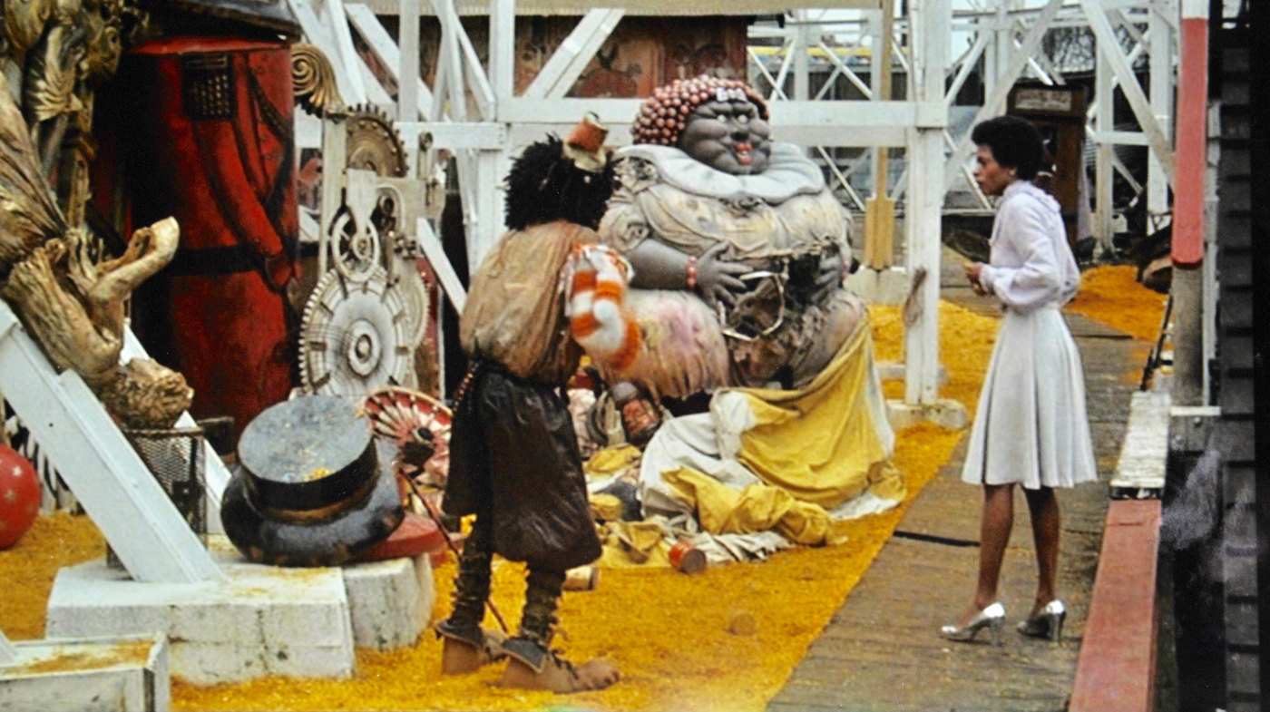
My Nominations: Brazil. Ran. Back To The Future. The Goonies. Subway. The Company Of Wolves. Return To Oz. Day Of The Dead. Santa Claus The Movie. Clue.

Believe it or not, I did strip down my Nominations from an even larger list. Only two of the official picks make it to my list, bringing with them a range of cult flicks and family favourites. Back To The Future has a lot of fun showcasing the same sets with a thirty year difference, with a wonderful eye for detail. The Goonies gives as a number of iconic places from start to finish – opening with a house every 80s kid wanted to live in, to a cabin no-one wanted to be trapped in, down into booby-trapped filled caves, and finally into an underground lagoon complete with pirate ship.

Briefly leaving the US, Subway was the beginning of Luc Besson showcasing his style while also being the flag-bearer for France’s Cinema Du Look movement. The Company Of Wolves has style to spare, an overly dark fantasy which is perhaps memorable more for how it looks than what it says. Return To Oz is a grim vision of what won over cinema-goers decades before, with a crumbling Oz resembling a haunted, post-apocalyptic wasteland rather than a colourful playground.

Keeping things grim, Romero’s Day Of The Dead uses its massive underground sets like a prison, pitting the few remaining humans of the world against each other as well as the dead. Clue is a classic murder mystery caper – and you can’t have one of those without a suitable location, in this case a mansion deliberately seeming out of time. Finally, Santa Claus The Movie is a charming Christmas film which was the standard vision of ‘The North Pole’ for many a child for many a year.

My Winner: The Goonies.

Let us know your winner in the comments!

Best Art Direction – 1984

Official Nominations: Amadeus. 2010. The Cotton Club. The Natural. A Passage To India.

A fine list of nominees in the Art Direction category this year, with Amadeus the worthy winner. 2010 is the inferior sequel to 2001, but it is another excellent example of the craft of Art and Set Direction to bring something unseen before to the screen. The Cotton Club is underseen as far as Coppola films go, and while it’s far from his best work, it still looks great and is one of the prettier films set in the era of Mobsters, Molls, and Jazz. The Natural is not on par with the other nominees, but still looks fine, while A Passage To India is an expected feast for the eyes.

Official Winner: Amadeus.

amadeus-artdirection | News from the San Diego Becks

My Nominations: Amadeus. 2010. The Temple Of Doom. Purple Rain. Dune. Once Upon A Time In America. The Terminator.

Along with two official nominees, I bring in a batch of Sci-Fi classics and cult hits. The Temple Of Doom goes above and beyond Raiders for me, in terms of its overall aesthetic. The gigantic sets for both the overground and underground Thugee Palace are impressive, along with the booby-trap filled tunnels leading in and out.

Purple Rain is Prince, of course. I’m not much of a fan of the song, or the film, or the performer, but it remains iconic. Dune, as divisive (bad) as it is, also deserves recognition for its Art Direction as it still stands out as a bizarre one-off product.

Once Upon A Time In America is a better version of The Cotton Club, while The Terminator gives me everything I want visually from a Sci Fi film – or is it that everything I want visually from a Sci-Fi film was influenced almost entirely by this film? It’s the clash of night and neon, shadows and light, flesh and chrome, city and wasteland which is so enticing to me, a nightmare lived out in a familiar world.

My Winner: The Terminator

Let us know your thoughts in the comments!

Best Art Direction – 1983

Official Nominations: Fanny & Alexander. Return Of The Jedi. The Right Stuff. Terms Of Endearment. WarGames.

The most interesting inclusion here is probably WarGames – it’s cool that it’s here, and it’s deserved, but it’s interesting because it’s not the sort of thing that The Academy ever pays attention to. Elsewhere, Fanny & Alexander was the winner. It’s a worthy winner, but it’s a 1982 film so doesn’t make my list. Terms Of Endearment gets an inevitable and unnecessary nomination. The Right Stuff should have been a front runner here, but there’s no question that Return Of The Jedi is my winner.

My Winner: Return Of The Jedi

My Favorite Scene: The Gang at Jabba's Palace | StarWars.com

My Nominations: Return Of The Jedi. The Right Stuff. Wargames. Liquid Sky. The Hunger. The Keep. Videodrome.

Any number of alternate films could have made it to my list, but I’m trying to be more selective these days. Apologies to Scarface and Flashdance. The Keep is not a film I’m very fond of, but its visuals are the one thing which make it memorable. Liquid Sky deserves to be remembered for its visuals and more, while The Hunger looks gorgeous from start to finish. Finally, Videodrome is one of the more visually unique films of an era which had a lot of breakthrough sci-fi films and also deserved an official nomination.

My Winner: Return Of The Jedi.

Let us know your winner in the comments!

Best Art Direction: 1982

Official Nominations: Gandhi. Annie. Blade Runner. La Triviata. Victor/Victoria.

A solid list of nominations with no real surprises, as period pieces and musicals are represented as the regularly are in this category. Blade Runner is perhaps the unusual choice given it’s a Sci-Fi movie, but it was so visionary that it couldn’t be overlooked. Let’s be honest, Blade Runner is going to be my winner. Gandhi picked up the official win – an epic in every sense and one which would have been considerably less impressive had they not nailed the look.

Annie is a musical – we all know the story, the songs, the red hair. Musicals have exactly two things going for them – music and visuals. The songs are mostly irritating yet catchy in Annie, and it looks okay. It’s hardly a standout visual treat. Victor/Victoria fares better on the visual front while La Triviata puts a lot of stock in its interiors but can be dismissed as a 1983 release.

My Winner: Blade Runner

Blade Runner (1982) | film freedonia

My Nominations: Blade Runner. Conan The Barbarian. The Dark Crystal. The Wall. Poltergeist. The Thing. Tron.

While it’s a foregone conclusion that Blade Runner is sweeping up here, there are a number of notable also-rans to consider. Tron was every bit as revolutionary as Blade Runner yet aged much more quickly and lacked the narrative quality to warrant anything more than a brief nod in awareness of its existence. The Dark Crystal too deserves a mention, given the amount of dedication, talent, and effort involved in creating its world. The Wall brings together all manner of chaotic art styles in its smorgasbord of debauchery, while Poltergeist takes its suburban setting and wrenches every ounce of dread out of it as any Haunted House movie has in the past.

Conan The Barbarian suffers from looking cheap in comparison to some of the other films on the list, but excels in its world-building in a time of brutality, while The Thing uses its edge of the world setting in just as claustrophobic a manner as its long corridors and shadow encrusted rooms do.

My Winner: Blade Runner

Let us know your winner in the commenrs!

Best Art Direction – 1981

Official Nominations: Raiders Of The Lost Ark. The French Lieutenant’s Woman. Heaven’s Gate. Ragtime. Reds.

Heaven’s Gate would be a worthy winner, but as it’s a 1980 movie we can immediately dismiss it. Raiders got the win this year – it’s my winner too thanks to the variety and meticulous detail of its sets and overall production. The French Lieutenant’s Woman, Ragtime, and Reds are justified in their inclusion in a year when there were any number of costume, sci-fi, and history oriented pieces to choose from.

My Winner: Raiders Of The Lost Ark.

20 facts you might not know about 'Raiders of the Lost Ark' | Yardbarker

My Nominations: Raiders Of The Lost Ark. Mephisto. Das Boot. Clash Of The Titans. Escape From New York. For Your Eyes Only. Gallipoli. The Road Warrior. Quest For Fire. Time Bandits.

It’s a mystery and a shame that some of my entries were not official picks – perhaps the biggest disappointment being the absence of Time Bandits, a worthy nomination surely in anyone’s eyes. For me, that takes a place in the four horse race along with Raiders, the post-apocalyptic S&M wonder of The Road Warrior, and the future shock nightmare of Escape From New York. 

Elsewhere, Clash Of The Titans delivers the goods in being, to this day, one of the best Greek mythology/sword n sandals movies, while Quest For Fire places most of its importance on its visual appeal. Mephisto and Das Boot were nominated elsewhere, and should have been in with a shout in this category, while Gallipoli was just as noteworthy while being ignored entirely. Finally, For Your Eyes Only remains one of my personal favourite Bond movies from a look and feel perspective, while lacking the scale and scope of some other entries, it uses what it has in a more meaningful, less extravagant way to echo the more grounded, serious tone of the movie.

My Winner: Escape From New York.

Let us know your winner in the comments!

Best Art Direction – 1980

Official Nominations: Tess. Coal Miner’s Daughter. The Elephant Man. The Empire Strikes Back. Kagemusha.

I can see why Tess wins this. A literary adaptation and a costume drama given the Polanski treatment. It had to win something, right? I can’t deny the skill involved in making it look so good. But there’s at least two films officially nominated which it doesn’t stand a chance against. Coal Miner’s Daughter – it’s here to top up the number of nominations The Academy felt it should receive. The Elephant Man is on a level with Tess if not a step above, while Kagemusha benefits from Kurosawa’s switch to colour and Yoshiro Muraki’s attention to detail. You could say this was a veteran nod, but it’s deserved as the entire film is a feast for the eyes. Your only winner, surely, has to be The Empire Strikes back, expanding the living, breathing Star Wars universe to an endless array of locations each with their own design hinting at cultures stretching back centuries.

My Winner: The Empire Strikes Back

The effect of 'Star Wars: The Empire Strikes Back' can still be felt after 40 years | Space

My Nominations: The Empire Strikes Back. Kagemusha. The Changeling. City Of Women. Tess. The Elephant Man. The Fog. Inferno. The Shining.

I Bring over four of the official choices and add a batch of horror movies. City Of Women isn’t a horror movie but its dreamlike qualities and dazzling Circus like style certainly warrants a nomination. While Inferno is not as visually daring or dazzling as Suspiria, it does take things up a notch with its abstract stage like vision of New York complete with abnormal shadows and lights, curtains, apartment blocks, books, and cellars. The Changeling is quant by comparison but is more of an updated version of the creaking haunted house movies of the 60s. It retains much of the style of those movies with the grand old house set up to look as foreboding and as ominous as possible. The Shining takes the haunted house idea further, instead placing a familiar story inside the confines of a sprawling, senseless hotel, a labyrinth of illogical corridors and the excess of a world long dead. Finally, The Fog takes the ghost story to its next logical step by haunting an entire town, the seaside idyll of Antonio Bay with the vengeful spirits too busy stabbing and scaring than stopping to appreciate the boats, lighthouses, streets, homes, and churches which Carpenter, Cundy, and Wallace provide for us.

My Winner: The Empire Strikes Back

Let us know in the comments which movie you would pick!

Best Art Direction – 1979

Official Nominations: All That Jazz. Alien. Apocalypse Now. The China Syndrome. Star Trek.

A decent list of nominees for a change, with The Academy fully embracing genre movies. They still picked the musical for the win, but what are you gonna do. All That Jazz deserves a nomination of course, but it pales in comparison to Alien. The set design of the Nostromo and beyond in Alien takes the work of 2001 and Star Wars to the next level. The film looks both futuristic and familiar, advanced and run down, human and alien. It’s the obvious winner.

Apocalypse Now succeeds in every level – Art Direction is no exception, while Star Trek advances upon the work of the series and takes inspiration from the big hits of the interim. Finally, The China Syndrome is the Chernobyl of 1979, and as such is tense and authentic.

My Winner:  Alien

Ridley Scott's Alien Created Its Own Genre 40 Years Ago | Consequence of Sound

My Nominations: All That Jazz. Alien. Apocalypse Now. Star Trek. Dracula. Escape From Alcatraz.

I add a number of notable choices to my list. 1979’s Dracula is an exercise in style and eroticism more than anything else, with a style not truly replicated until Coppola’s 90s effort. Escape From Alcatraz is impressive due to the work to authentically recreate and capture the look and feel of Alcatraz just before its closure.

My Winner: Alien

Let us know in the comments what you pick as winner!

Best Art Direction – 1978

Official Nominations: Heaven Can Wait. The Brink’s Job. California Suite. Interiors. The Wiz.

Heaven Can Wait was a shoe-in for the win this year, more to do with the calibre of the cast and director than the actual Art Direction. Visibly it’s good, but it takes too much of a leave out of A Matter Of Life And Death’s book without really adding anything new. The Brink’s Job is one of the forgotten William Friedkin movies – a comedy heist type caper raised by its performances and assured direction. Taking place in many familiar places around Boston likely nailed its nomination. Interiors in name alone seems like it should be nominated here, but it mimics Bergman without truly capturing the stark and often paranoid look his films were known for. California Suite gets as meta a nomination as you could think of, taking place in LA in and around The Academy Awards themselves with many locales known to the voters. Finally, The Wiz takes one of the most famous films of all time and some of its most iconic fantasy lands and twists them into a bizarre version of 70s NYC. At least in taking elements that audiences are familiar with, it tries to do something different and largely succeeds.

My Winner: The Wiz

The Wiz Redux; or, Why Queer Black Feminist Spectatorship and ...

My Nominations: The Wiz. Heaven Can Wait. Midnight Express. Superman. Days Of Heaven. A Wedding.

Only my winner and the official winner make it onto my personal list of nominations, joining a vicious satire, a vicious prison movie, and Clark Kent. Midnight Express paints an excessively bleak picture of prison life with all life and colour ripped from the screens, while Robert Altman’s lesser known A Wedding spares no expense in showcasing and pulling apart a day in the life of a bunch of rich people. Out of all the films this year it seems most odd that Days Of Heaven was missed here, an obvious nomination to most. My vote goes to Superman – from exploding dams to busy media offices, to the fortress of solitude to the planet of Krypton, Superman travels from one edge of the galaxy to the other and never misses a beat in portraying the adventures in a more or less human and realistic way.

My Winner: Superman

Let us know your winner in the comments!

Best Art Direction – 1977

Official Nominations: Star Wars. Close Encounters. Airport 77. The Spy Who Loved Me. The Turning Point.

Similar to the Costume Category, this was always a one horse race. Not quite as one-sided as Costume as we have some notable nominees here, but we know Star Wars is the winner, what with its Death Stars and Millennium Falcons and Cantinas. Close Encounters is a close second, while Airport 77 and The Turning Point don’t offer anything out of the ordinary. The final option then is The Spy Who Loved Me. It’s always interesting to me when a Bond film is nominated for an Oscar, because it happens so infrequently. If there is one category it should have excelled in over the years, it’s this one with Ken Adam pulling magic from his hat on multiple occasions. Of course it took Adam to work on Barry Lyndon before The Academy paid attention to him (though he did get a nomination in 1956 too) but he finally got some respect for his epic Bond work this year thanks to his work on Stromberg’s base etc.

My Winner: Star Wars

aabc33a148fd552380e2d0d160a28488

My Nominations: Star Wars. Close Encounters. The Spy Who Loved Me. A Bridge Too Far. The Duellists. Eraserhead. Hausu. Suspiria.

The Academy all out avoids some major picks this year. I bring over the three best nominees, but there’s no way you don’t nominate Suspiria here. It’s on, no questions. Similarly, Hausa just has to get on – if you’ve seen it, there’s no way you argue against it being here. A Bridge Too Far and The Duellists both deserve a nomination, though I’d be happy with either or, and that leaves Eraserhead as another film with such a unique look that it hasn’t really been replicated in the years since.

My Winner: Star Wars

Let us know in the comments which film gets your vote!

Best Art Direction – 1976

Official Nominations: All The President’s Men. The Incredible Sarah. The Last Tycoon. Logan’s Run. The Shootist.

A clear front-runner and winner this year with All The President’s Men being set in the familiar locations of a bustling workplace and real life DC hotspots. The newsroom was entirely recreated for the film, but you wouldn’t know it given how realistic it all feels, while everything from the lighting to the costumes feel sweaty and tangible and at once closing in and expanding with possibility. Logan’s Run gets the Sci-Fi nod and is one of the more unique (for the time) visions of a possible future. Cheesy now, I’ve always had a fondness for the sets and the overall look. The Last Tycoon is probably famed now more for its authentic setting than the plot or performances while I’m not sure anyone remembers (or needs to remember) The Incredible Sarah. Finally, The Shootist is a now underrated Don Siegel Western featuring John Wayne – his last role – his character bemoaning the end of ‘The Old West’ and the film representing loss in both its look and plot.

My Winner: All The President’s Men

C8-d1qbVYAAKg3V

My Nominations: All The President’s Men. The Last Tycoon. Logan’s Run. 1900. Bugsy Malone. Carrie. Marathon Man.

I add everything from musicals to horror movies to the three copied from the Official Nominations. 1900 is an epic in every sense, and if there is one thing most epics have in common it is a painstaking attention to detail, with Bertolucci and co showcasing the skills learned in previous stylized films such as The Conformist. Bugsy Malone, as much as I hate it, has a very specific look and feel which suits the malarkey of the story and its gimmick perfectly. Carrie is an exercise in stylized editing and post-menstrual pressure with both home and school rarely shown to be anything more than different levels of hell, while Marathon Man uses shadow and light to torment the viewer like few other films.

My Winner: All The President’s Men

Let us know your winner in the comments!